What are some basic facts about how colors are understood and used?
How can we start to think about using color in R? Well, to start there are 657 built-in colors with R. You can easily view the names using the command colors( ). You can either use the name or index number of the color in your code.
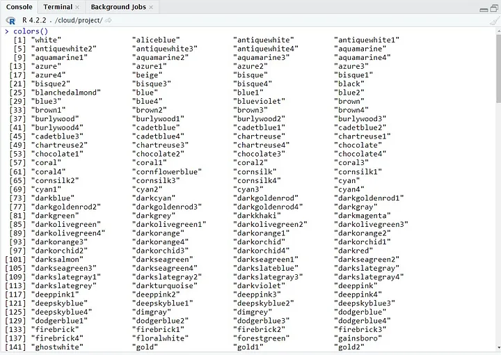
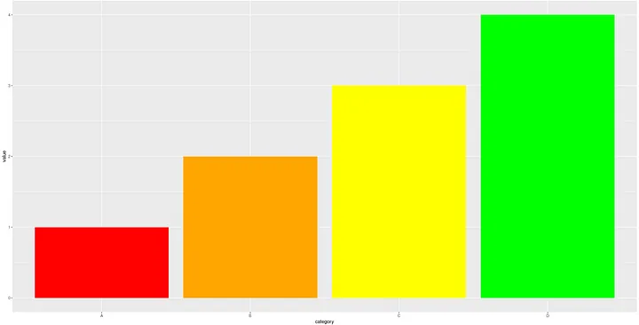
Here is an example of how you can use these colors to create a bar plot:
 # Install necessary package
 install.packages('ggplot2')

 Load necessary libraries
 library(ggplot2)

 # Generate data
 df <- data.frame(
 category = c("A", "B", "C", "D"),
 value = c(1, 2, 3, 4)
 )

 # Create plot
 ggplot(df, aes(x=category, y=value)) +
 geom_col(fill=colors()[1:4])
This will create a bar plot with the first four colors in the base color palette.
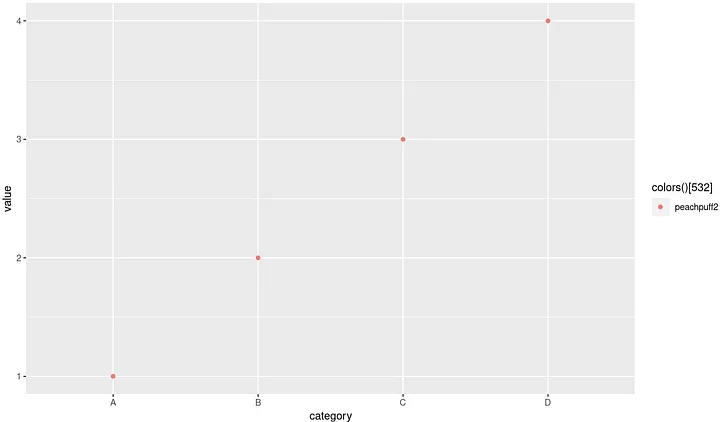
You can use any of the 657 colors in the palette by changing the index of the colors() function. For example, colors()[657] would use the final color in the palette.
You can also easily use these colors in any other types of plots, such as scatter plots, line plots, and more. Simply specify the color aesthetic in the aes() function and use a color from the colors() palette as the value.
 # Create scatter plot
 ggplot(df, aes(x=category, y=value, color=colors()[532])) +
 geom_point()
Each color also has its own hexadecimal code. Hexadecimals are colors used in displaying web pages on the World Wide Web, and the methods for describing and specifying those colors. The hexadecimal format is also known as a hex color code. Hex color codes start with a pound sign or hashtag (#) and are followed by six letters and/or numbers. The first two letters/numbers refer to red, the next two refer to green, and the last two refer to blue. The color values are defined in values between 00 and FF
If you define a color by either its proper name or its hex code, just put it in quotes and there you have it. This is easier for humans to use than index numbers, I think.
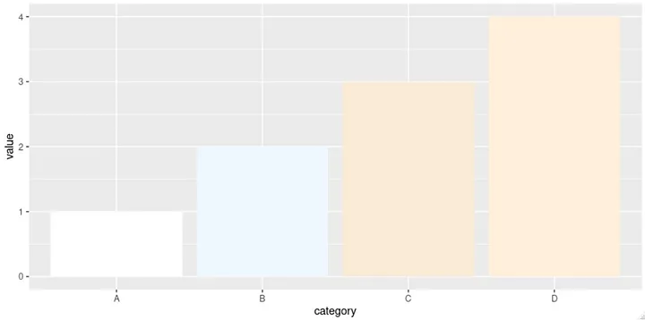
 # you have to express multiple colors as a vector
 ggplot(df, aes(x=category, y=value)) +
 geom_col(fill=c('red','orange','yellow','green'))
Colors can also be specified as an RGB triplet, another common format, from 0 to 255, but I have never found it necessary to do so in R.
More good news is that it is possible to use preset themes in R packages that are complementary not only in color scheme but to your presentation itself. Sets of colors that are already grouped together in a sensible manner are at your disposable with a few commands.
RColorBrewer is one the best known and used R packages. The RColorBrewer package is a great tool for choosing color palettes for data visualizations in R. It provides a wide range of pre-defined color palettes that are designed to be colorblind-friendly and printer-friendly. These palettes can be used as uniform sets and they save you the trouble of mixing and matching.
To use the RColorBrewer package, you will first need to install and load it:
 # Install RColorBrewer package
 install.packages("RColorBrewer")

 # Load RColorBrewer library
 library(RColorBrewer)
Once the package is installed and loaded, you can use the display.brewer.all() function to view all of the available color palettes:
 # View all available color palettes
 display.brewer.all()
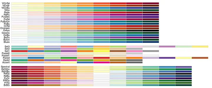
These are the 3 types of palettes shown above:
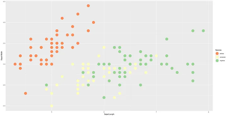
If you are using ggplot you add a layer called scale_color_brewer( ) to the original plot. Be sure to match the type of palette that you choose to the type of data that you have. Otherwise you may get an error. Notice how “Spectral” is a qualitative palette and it is being used to represent the species of flower (categorical data).
 p <- ggplot(iris,
 aes(x=Sepal.Length, y=Sepal.Width, color=Species)) +
 geom_point(size=8)

 p + scale_color_brewer(palette = "Spectral")
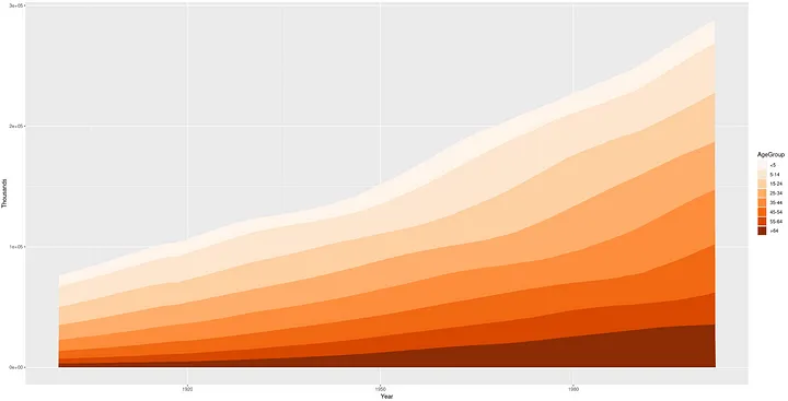
Here is an example of using “Oranges.” It is a sequential palette so it is used to denote values from low to high.
# Create the base plot
uspopage_plot <- ggplot(uspopage, aes(x = Year, y = Thousands, fill = AgeGroup)) +
  geom_area()

# ColorBrewer palette
uspopage_plot +
  scale_fill_brewer(palette = 'Oranges')
# Notice how the command changes to scale_fill_brewer (boxplots,bars,violin, etc.)
# This is an important point to avoid errors
To specifically choose a color palette you could also use the brewer.pal() function and save the palette as an object then add that back to a base R plot.
For example, to choose the "Blues" palette with 8 colors, you can do the following:
 # Choose the "Blues" palette with 8 colors
 colorz <- brewer.pal(n = 8, name = "Blues")

 # Either directly use brewer.pal( ) to get the palette
 # Using a simple vector just to show the colors
 barplot(c(2,5,7,10,12,16,18,22), col = brewer.pal(n = 8, name = "Blues"))

 # Or just set the col argument in barplot in base R using the object
 barplot(c(2,5,7,10,12,16,18,22), col = colorz)

 # ggplot2 is going to ask for a dataframe, so base R graphics
 # are actually better for quick glances at single vectors
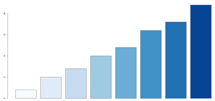
Notice how “Blues” is a sequential palette and it is being used to represent values from low to high.
RColorBrewer contains over 170 different colors. To learn more check out its reference page or other good sources.
R Graph Gallery and Winston Chang’s “R Graphics Cookbook” are always excellent references in regard to using color in R. Vidiris is another good option for easily selecting compatible colors.
She comes in colours everywhereSo what are some basic facts about color that will guide you on your way?
Redundant fact for emphasis: remember that colors can be expressed in their proper name and hex codes (among other ways).
Black (#000000) — This is the darkest color possible. It is not a true color, but the absence of all colors except black. It works great for filling a canvas with any color you want. You can use black to easily make any other color you need. But be careful, because it can also create a monotone effect.
Black works especially well for labeling things on a graph or chart. And you can use it to create texture in a painting. You can also use black to create outlines for text to make it stand out better against the background.
Many programmers are accustomed to viewing text in black because it is easy to read. But this is often not the best practice when you are designing a document or poster that will be displayed to the public.
White (#FFFFFF) — You should use this whenever possible to highlight important information because it touches a primal nerve. It helps people understand what your message is about right away. White can also be used to draw attention to something that would otherwise be difficult to pick out. For example, you can use white to call out important phone numbers or URLs in your documents or posters. Instead of using colorful graphics or text to draw attention to these areas, you can simply place a white box around the information to highlight them. White also works really well as a general background of a painting or other artwork. It makes each appear brighter and more inviting.
Most people like to use a mixture of black and white when creating their images. This is an exotic color known as “gray”(#808080)
Red (#FF0000) — Red is a strong and vivid color. It has a lot of energy and is very popular for use in logos and signs. It works well for drawing attention to a specific area of an image. It can also be used to draw the eye to an element that you want your audience to notice immediately. Many people use red in their paintings and artwork to create bold and vibrant images. It can also be used to create textures and patterns in your paintings to give it added depth. Some people use a red color scheme to make their art look nostalgic, and others use it to create a feeling of luxury or wealth. Chinese culture associates red with luck and it is not uncommon for a bride to wear red in order to attract good fortune.
People view the color red as a positive and powerful emotion. It can be used to make a bold statement and attract the attention of the audience. However, it can also be too intense and overpowering for some people’s tastes.
Green (#00FF00) — Green is an uplifting and positive color that inspires a sense of peace, harmony, and relaxation. Some people believe that green is the color of the heart chakra and that it carries an energy that is healing in the environment. For these reasons, many people prefer to use subtle greens in their homes as it creates a relaxing and comfortable atmosphere. If you use green as an accent with browns and grays, a nice earthy effect is the result. It also symbolizes nature and our planet, making it a popular choice in art displays as well as interior design.
Blue (#0000FF) — Blue is a color that has long been associated with royalty, art, business and nature (think water), making it a color with a lot of applications. The first documented use of blue pigment is using blue azurite. This is a vivid deep blue naturally occurring mineral originating from copper. It was used widely in ancient Egypt for decoration and jewelry. Later, in the Renaissance, the mineral was crushed and used as the expensive paint pigment ultramarine.
Final ThoughtsThis is a very basic introduction to using color within R, so of course there are many more ways to use color than what is described here.
The fact that browns, grays and greens represent nature and in general homey and soothing thoughts was helpful to me. It makes my interior home design work easier if I start with those gentle hues of earth tones and add splashes of red and orange as appropriate.
Speaking of red and orange, please remember that many people are color blind. This can make it problematic to get your point across using red and green. The good news is that orange (#FFA500) and blue (#0000FF)are excellent counterparts and substitutes and of course, you can rely on RColorBrewer to direct you if you use:
display.brewer.all(colorblindFriendly = TRUE)
Try it out on your own now and leave a comment about it. Thanks for reading!
